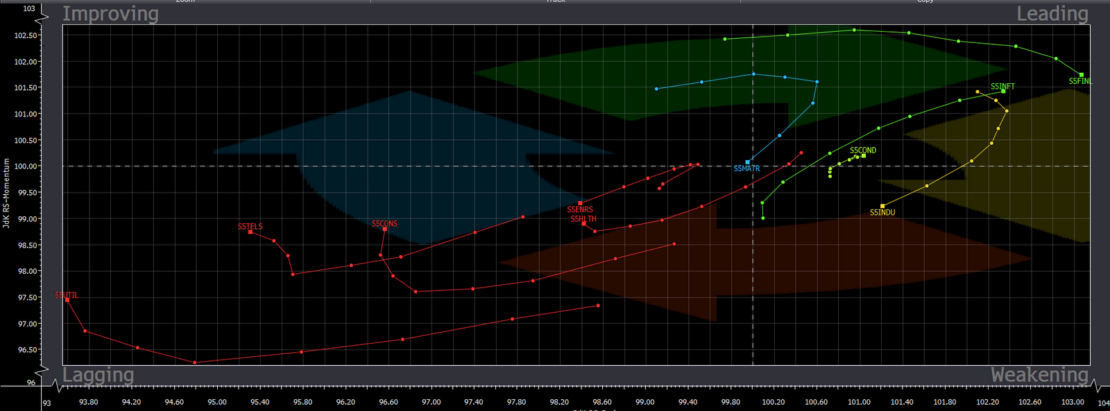
What use is this you say? Well as a technician, this information is used to trade from the top down approach - similar to a fundamental analyst using his/her data to trade from a top down approach. If we know which sectors have money flowing IN, then we can dissect the sector ETF's and trade the strongest stocks within that sector with a buy-the-dip mentality. Conversely, knowing which sectors have money flowing OUT, then we can either lighten any longs or for more aggressive traders trade against the prevailing big trend (although with the sector weakness trend), and short light volume bounces.
Next week I will shed a little more light on which sectors charts look the best/weakest to give you further insight into where to trade.
Have a great weekend!
No comments:
Post a Comment